Dashboard Agent Report
Agent snapshot of how successfully agents and teams are utilizing the Brivity platform
My Role : UX/UI Designer
Agent Report Snapshot
Duration: 6 months | My Role: UX/UI Designer
The agent reporting feature was created for agents and teams to track tasks, marketing success, agent activity, and overall statistics of what makes the largest impact on their company. The reporting page currently held data in three sections, each with different filters; new leads (showing stats on agent interactions), lead sources (stats on what marketing is pulling in the most leads), and daily due tasks.
The UX/UI process began with a brief from the project manager and design manager. After collecting the statistics and information to be transferred to the home page, we met with developers to discuss limitations early in the process. Specifically, the infographic UI was important to iron out early so developers could meet deadlines. All of the information was recorded in Productboard, along with project requirements, user insights, and competitor references.
Project Outline
The issue: Based on user feedback and recorded product usage statistics the reporting page was not getting traffic. Many agents were using a fraction of the product, making agents unsure if the price tag for the Brivity software was worth it.
The goal: Encourage users to utilize the entire Brivity platform by displaying up-to-date account statistics on their homepage dashboard.
Current Agent Reporting Design
Information is split between three tabs, Agent Activity, Lead Source, and Tasks. My goal was to pull vital statistics that would encourage feature discovery and diagnose company pain-points.
Main Objectives
Show a live agent activity feed so no team members are overlapping tasks.
Create a way for agents to quickly digest the most pressing tasks and reinforce tasks that Brivity Platform recommends upon set-up.
Display with numbers where the best marketing efforts are made based on lead source statistics.
Simplify filter process to apply to all.
Research
I began the process by reviewing user insights that had been gathered by the Project Manager. Requests from clients differed depending on their job position. Agents wanted to view they daily tasks while team leads wanted to view what their agent’s interactions looked like, and how successful specific marketing tactics were.
Design Decisions
Combine tabs into a single ‘Dashboard’ page.
Allows agents and team leads to digest information quickly and guide daily priorities. Based on company standards we encourage specific tasks to be prioritized by real-estate agents.
Display information visually.
Visually display what parts of the work-flow needs extra attention. Depending on the health of the stats agents may need to set-up more leads on auto-plans, improve their email response time or complete over-due tasks.
Simplify filters.
Separating ‘Auto Plans’ to a new tab allowed the ‘Home’ to not require specific filters.
Wireframes
Gathering Account Statistics
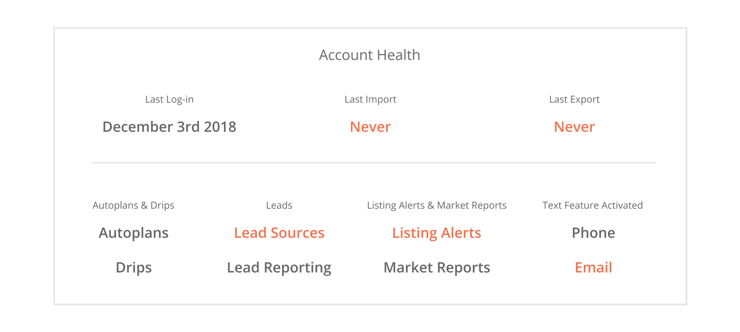
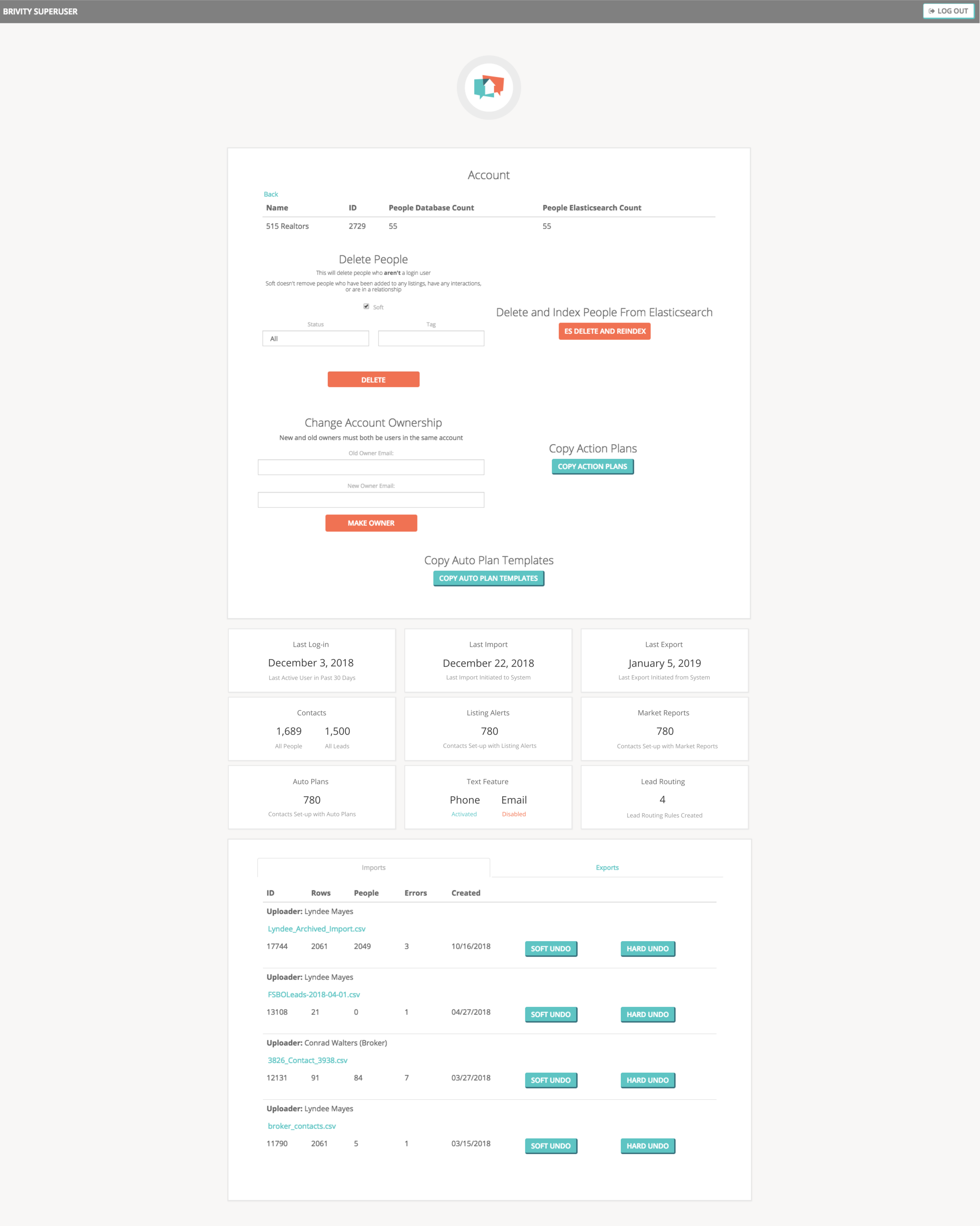
I began the design process by gathering account statistics that customer service representatives at the company often check when agents aren’t pleased with the software. Some of these stats show that agents aren’t using the product to its fullest extent and need to set-up more leads on listing alerts for example.
Account Statistics
Version 1
Version 2
Account Health Board V1.
Feedback was that it was not visual enough, and matching a style for a page the design manager was trying to get removed! New idea - adding these important statistics to the account dashboard.
Competitor Research
Our main competitor KW Command, released a dashboard feature in the middle of the initial account dashboard project. Our CEO wanted to pivot this project and develop our own version to stay competitive.
Research Findings:
Clarity is key. Don’t allow graphics to take over data hierarchy.
Separate statistics with bounding boxes. Data will be pulling from throughout the user’s account, make that clear.
Keep WCAG Accessibility Guidelines in mind when using colors and layering of shades.
Initial Design
My initial design compressed the reporting tabs into one page. This way filters would be applied all at once and agents had a quick-view of how their account was doing.
Feedback from my design manager was that the content was still too dense and needed to be more of a high-level account overview. This is when we made the decision to add this account snapshot feature to the home page, rather than simply a re-design of a condensed reporting tab.
Final Design
The new homepage concept created a day-to-day snapshot of the reporting pages to simplify and encourage agents to explore their statistics even further.
Daily due tasks will update in real time.
Database activity helps increase client response time and communication which Brivity CEO says is key to success.
Account health statistics simply show the most vital information and nothing more.
Dashboard (V1.)
At this point V1. has gone through development and is in beta testing. It shows live website activity similar to Database Activity on the finals designs I created. Hopefully the next versions will be pushed out for agents to use soon.


